Raft AI
After 4 years of accelerated growth we have built a great product that has improved the efficiency of our customers often 10x. At this stage of the product we've noticed that some of least tech-savvy users have been struggling with the product so I've set out to improve the experience of our app for the worst case scenarios of which we have many.
UI.UX
Zsolt Simon
Role:
Head of Design
Date:
Q4 2023
Complex, but purpose built
Our applications contains many panels, modes and is very dynamic in how it can be utilised and set up to account for the very varied use cases often required by Freight Forwarders in the logistics industry.
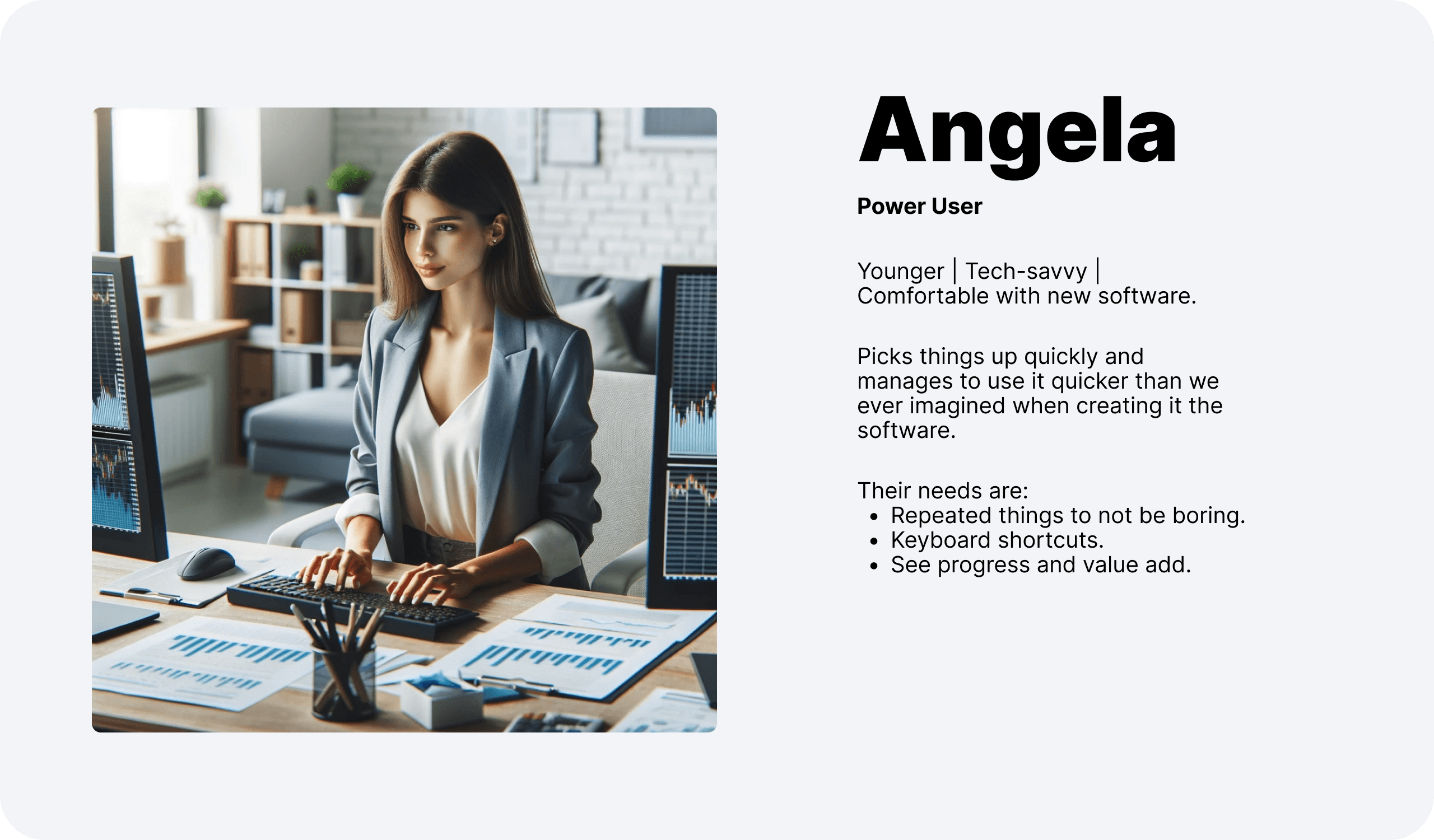
Before release of our latest inbox experience we've found that many users who were comfortable with technology were able to set up an ideal experience for themselves and use the app with minimal to no training.
Expecting different modes of focus we also included a Focus mode to allow for quick switching between a view where users. have an overview of all data and a view where you can do a deep dive into the documents you're extracting.
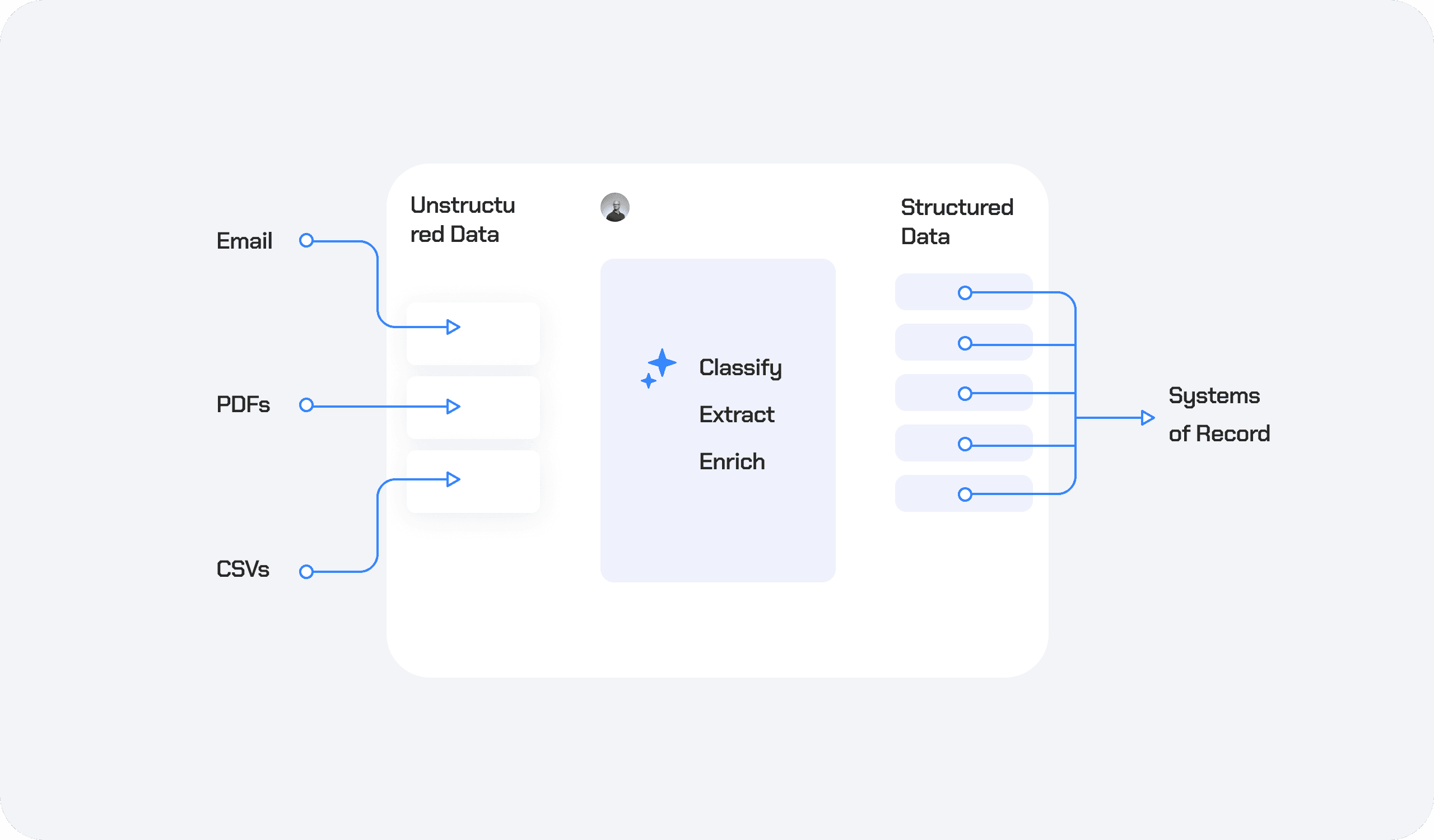
\ Core flow of Raft
Small screens & technical difficulties
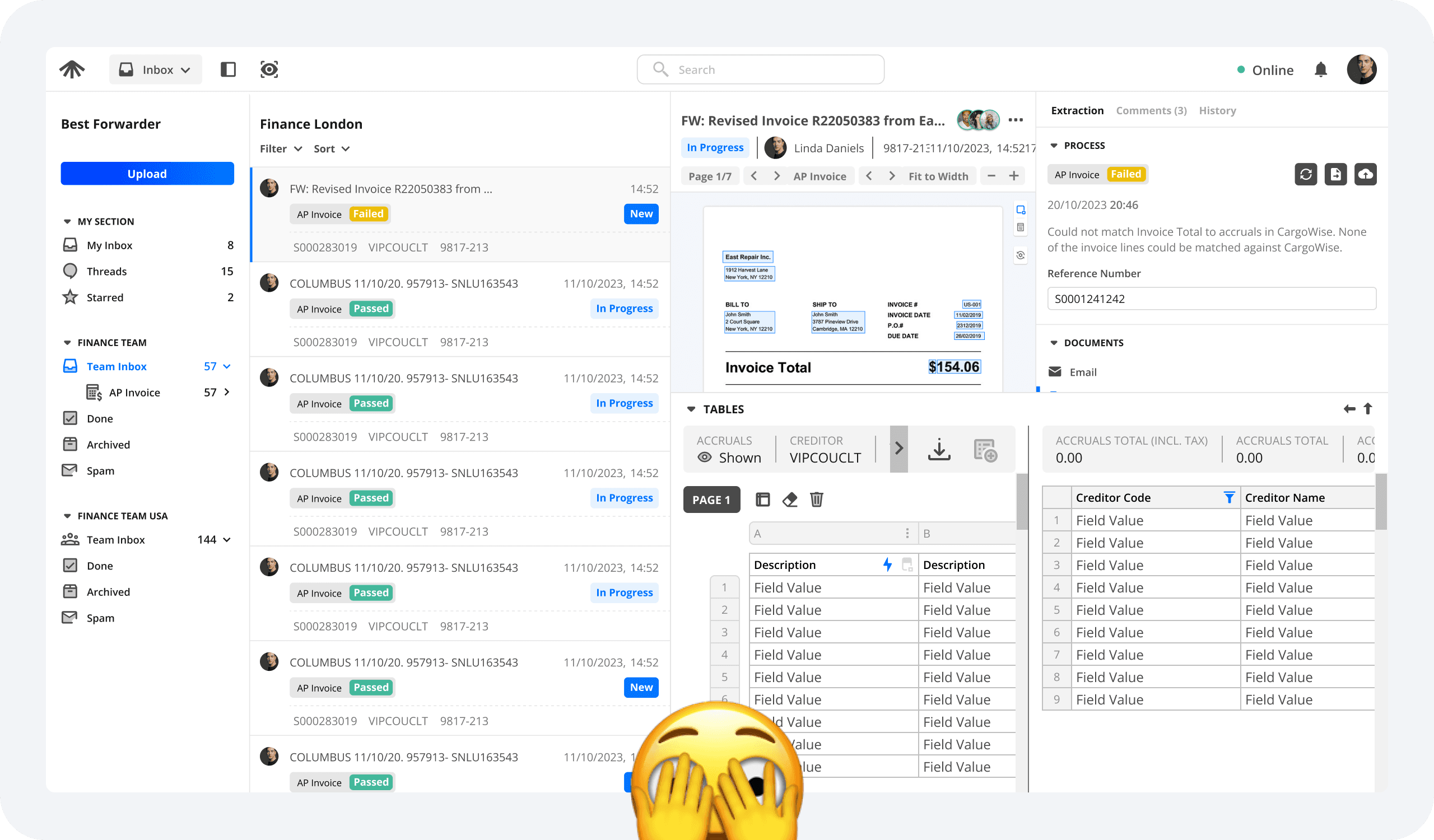
After release however we've noticed that our least tech savvy users are "afraid" of moving panels around and entering / exiting modes and often end up with a very squished experience especially on small, 11" Windows laptops.
They would often try to show everything at the same time and struggled with achieving a layout that would help them go through their most crucial flows.
During interviews we collected the following feedback:
The UI is cluttered
You have to fight the UI
Too much information
Complex and overwhelming
Users can't see what they're doing
They don't know why they'd use Focus Mode

Interviews & Analysis
I jumped on various zoom calls with our users. There was a mix of some of them really struggling and some of them being power users. I also made sure to include management and higher level stakeholders to see where the impact of the UX lands up and down the stakeholder chain.
I then took to FigJam to lay out and analyse the findings in user stories broken into 2 categories - beginner and established.
I find it essential to lay out clearly and in a shareable format the problems we as a team set out to solve. We can't just say "Janice is unhappy". From there it's straightforward coming up with solutions our entire team agrees on and would like to see go into the app. Find the user stories below.
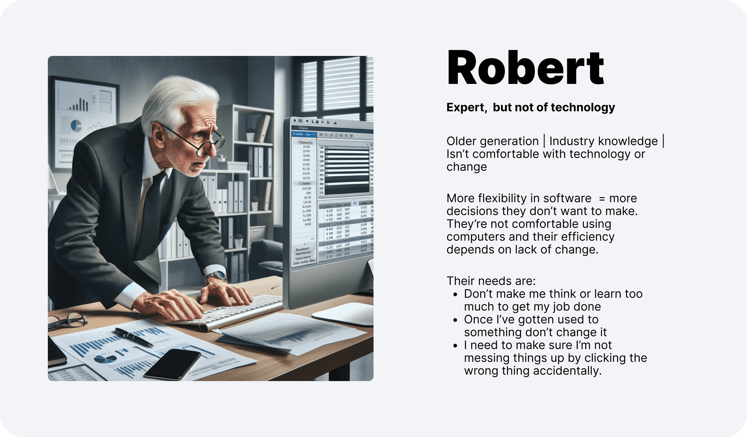
As a beginner user:
I need to know what the app is and how it will help me do my job.
I need to understand the basic concepts of how data flows through the app and how data comes into the app.
As I look at the app for the first time, I’m overwhelmed. It would be better if I was fed the experience step by step and could experience the value live so it clicks better.
I need to understand how to get the information I don’t know.
I’m afraid I’ll mess up some data. I need guardrails so I can trust that what I’m doing won’t cause any issues down the line.
As an established user:
I want to know what is most important for me right now.
I need to know if the data is correct so I don’t have to spend more time on it.
Considering the data isn’t ready to push, I need to know specifically what issues there are so I know what I can/have to do about it.
Most commonly what I have to do are re-occurring scenarios. I need to be able to do these fast and easily.
The most painful scenarios are often the not-commonly-occurring exceptions. I need to be able to either solve them or work around them without getting blocked
Once the data is pushed, I want to know what happened and if anything went wrong so I can follow up with further steps.
Once I’m done with processing a pack I need to know where it fits and how it is stored so I can refer back to it if ever needed.
Solution & Principles
We set out to help our beginner users first as our established users seem to be doing well enough for them to get the efficiency improvements our clients buy our app for.
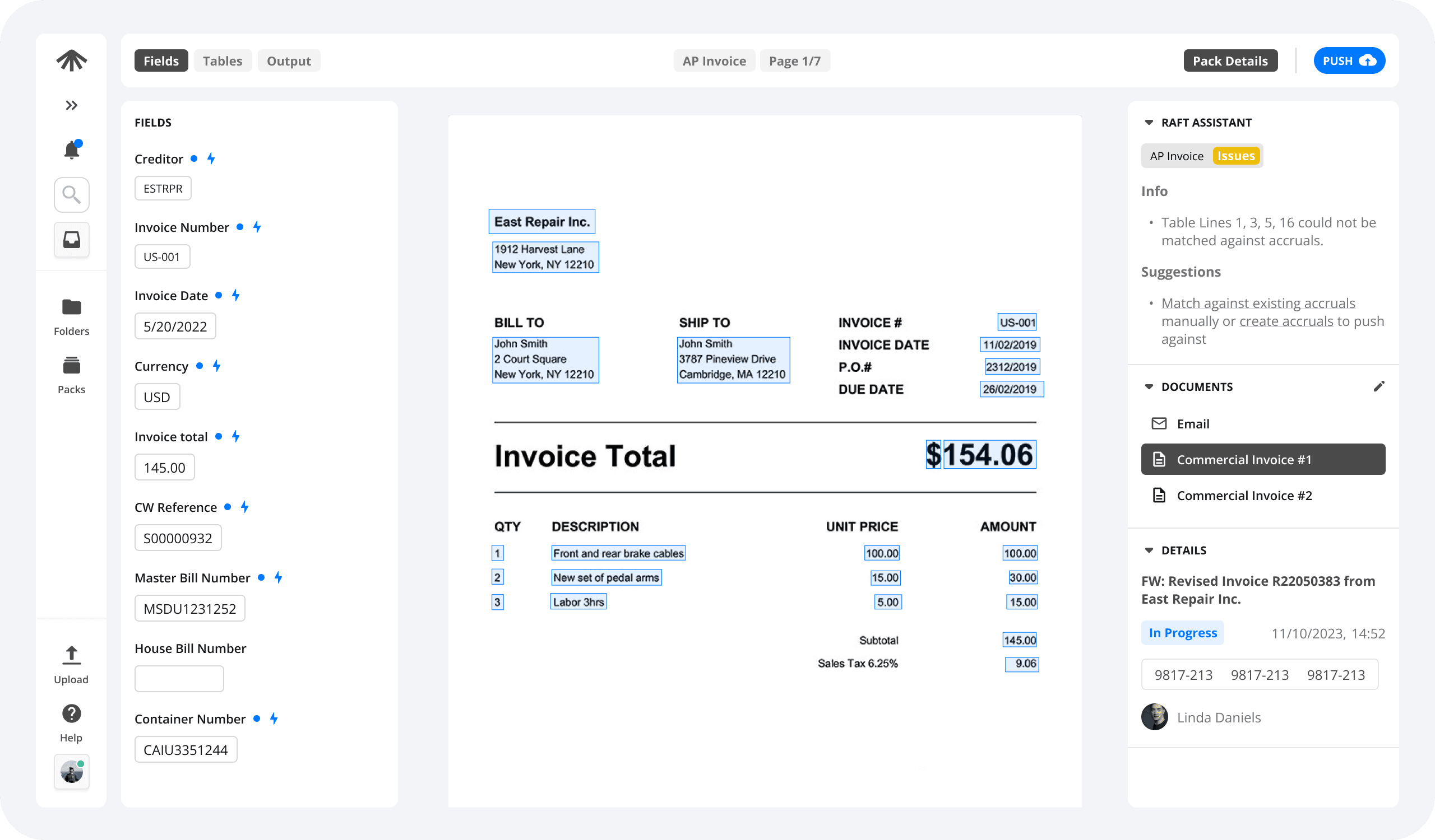
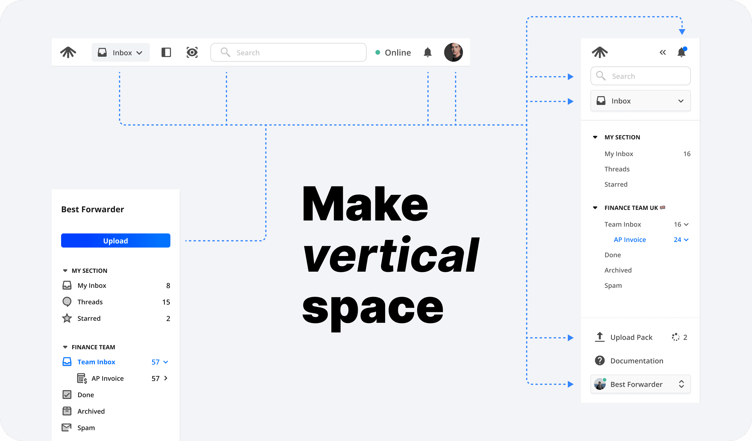
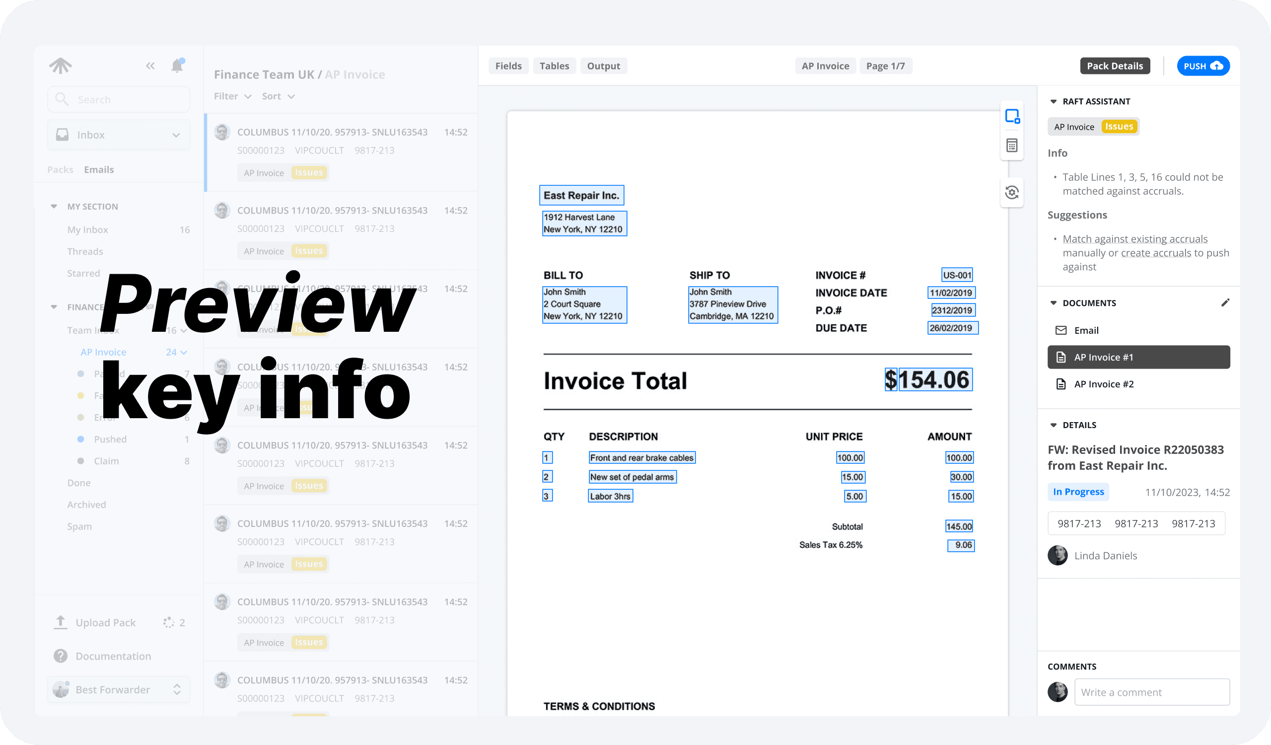
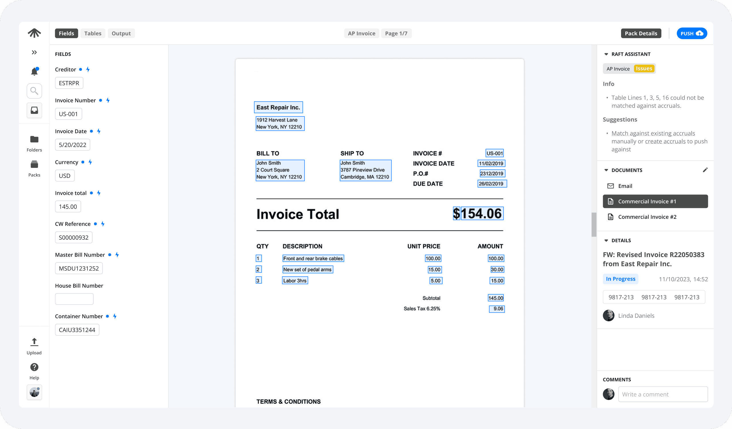
We had to make as much vertical space as reasonable as small screens run out of height quicker than they run out of width. In order to fulfil this we've moved the top nav-bar into the left and the pack details into the right hand side.
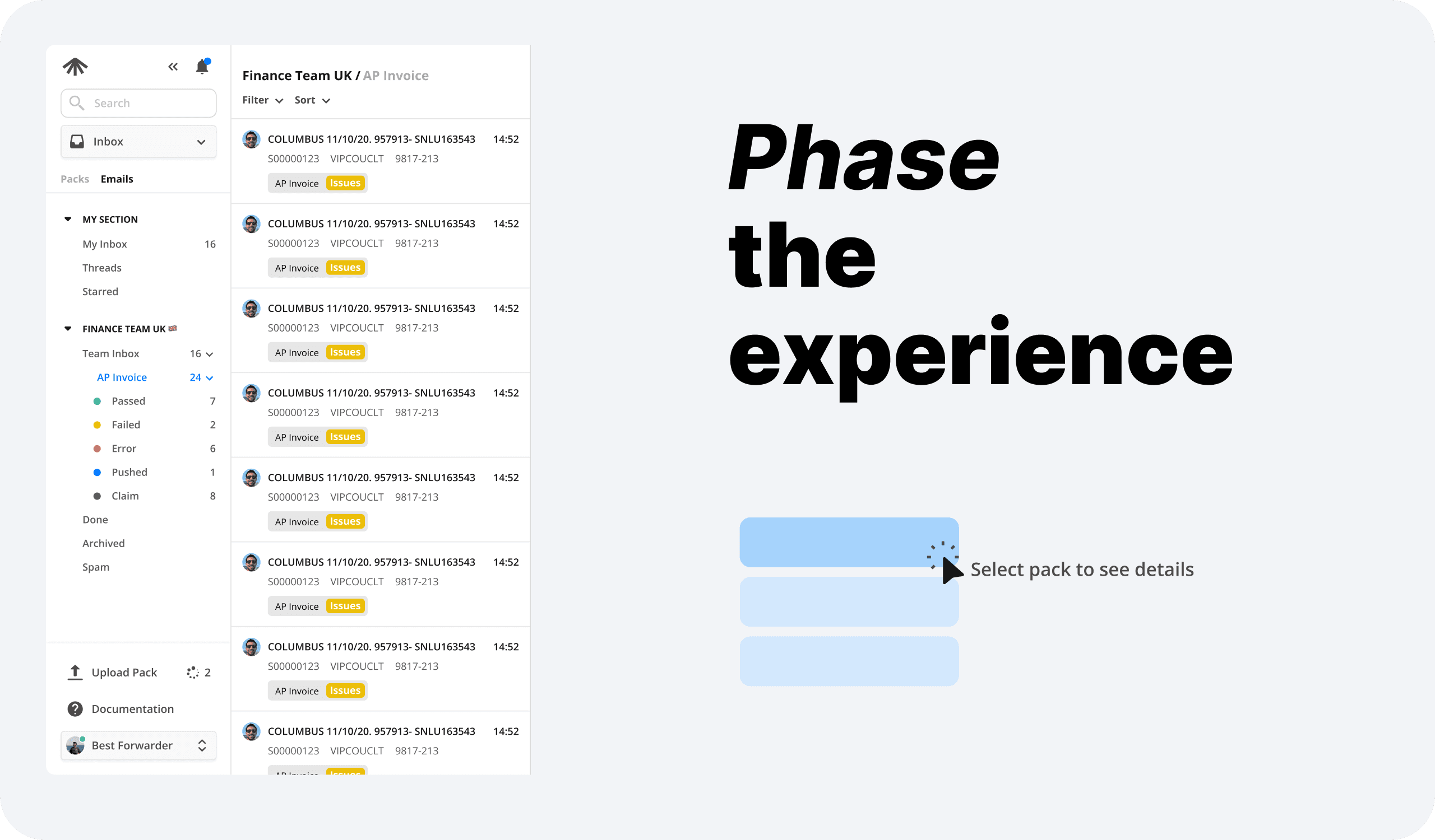
We phased the journey in order to lower users sense of overwhelm. Broken up into stages of browsing, decision and processing.
In the new layout panels show, hide, shrink and grow depending on the user's screen size & stage.
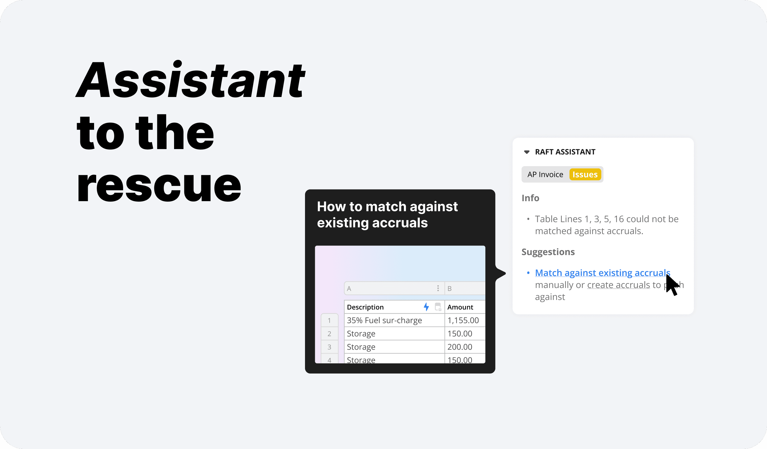
Lastly, we came up with the concept of raft assistant to guide users when they are lost.
Video walkthrough
Testing & Feedback
We jumped back on zoom with the PM on the project and started gathering input to validate if our designs are good or not.
For this we included our internal power users as well to make sure we don't only solve the issues of our Beginner users but maintain the experience of our Established users.
The feedback has been overwhelmingly positive with the key areas of focus having been tackled. Those being overwhelm, clarity & screen real-estate. The feature is currently in development and will go into beta Q2 2024.
Prototype
Oh, one more thing.
As a last touch I put 12px space between each panel to let the components breathe. This results in a perceived clarity and lowering of clutter.
This is counterintuitive as in reality you loose 12px on each side of the components but with the increase in negative space each component has a better chance to stand out on its own right and become more readable and legible.
